1.In what ways does your media product use, develop or challenge forms and conventions of real media products?
In the film it has typical things such as: titles, actors/actress’, narrative, storyboard and an institution.
The film has titles, which are normal to have in a film, there are around an average number of titles like used in many film introductions.
The actress isn’t really normal, because you don’t normally get eleven year old killers who push people off cliffs, I think that this challenges conventions of film because films aren’t usually made like this because people might find it hard to understand what is going on and why there is an eleven year old killer.
The narrative could possibly challenge conventions, because it is a weird one, having a killer/psycho child isn’t normal and it is hard to get to grips with, because it isn’t that realistic, because eleven year old children don’t go around pushing people off cliffs. It could work, because we have made it, and it is easy to understand because we have had feed back of parts that are not understood and edited that so it is easier to get to grips with.
I think that the film could give a message out saying how it is totally unrealistic that an eleven year old would kill.
In the research we decided that the child would have a background of being badly treated, so this could give off the message that you shouldn’t treat your child bad, because this might happen.
The meaning behind the intro is that things that happen in your past can affect you in the future, what ever it is. Take this intro for instance, the girl is badly treated at home, so she feels the need to get revenge on men of a certain age.
2.How does your media product represent particular social groups?
My media product represents a stalker/psycho killer.
This is shown throughout the film, because in the beginning we see the actress walking down paths, hiding in bushes looking at the person she is stalking, she is also seen behind him, she is watching him closely waiting for her moment to get him. She is shown to roll him off the cliff and him landing in water and being dead.
By seeing her following, watching and killing, the audience can tell what she is a stalker/psycho killer, even thought it might not be so obvious at the beginning of it, but it gets more towards shot three.
The target audience for this film is not going to be stalkers, it is most likely going to be people of “12/12A”, so it isn’t too scary and gory for them.
The blatant target audience would not be stalkers because it is about them, so they wouldn’t be able to watch it because it might affect them or give them ideas.
3. What kind of media institution might distribute your media product and why?
(Monday, 13 October 2008) I think that ‘Lionsgate’ or a smaller institution would distribute our product; I think that a smaller one would be more realistic, because we didn’t have much time and we spent little or no money on the film at all, it was low budget. By having a smaller institution it would be ok, but that would mean the film might not be as well known and as well advertised, because they won’t have as much money to spend on advertising and everything. It wouldn’t matter if we had a smaller one though because we have made a poster and that would give good advertisement.
4.Who would be the audience for your media product?
(Thursday, 11 September 2008) Now I think realistically the audience would be around a “12A” or a “12”. It is not scary or gory enough to be a 15, and I think that this audience might appreciate it better and get a little more scared because they are younger, and they don’t understand that things like this are not real.
This audience range wasn’t my first intention, because I thought it would be much easier to create something that would scare people, but now I know it isn’t easy to get the perfect storyline, because you have to think about how the audience are going to interpret it. It is harder than I thought to create something within the age range of a “15”, it has to have a certain amount of things to make it a “15”, which my film doesn’t have which is now why I think it would be between a “12A” and a “12”.
5. How did you attract/address your audience?
(Wednesday, 26 November 2008) To attract and address the audience for my film, my partner and I decided that we were going to create a poster, the effect of having a poster is that it can go out to any audience and anyone can see it and think I want to watch it.
We wanted to it make look like it would be in cinemas or on the internet and look like it was good enough to attract an audience. Therefore, we made the poster quite similar to the design of the movie ‘The Grudge’ which has given me so many ideas, and we used our actress Vanessa on it, we used ‘Photoshop’ to make the perfect poster, and we used our names on it as well. Also we put a few stars on it to look like it’s worth watching and it had a good review.
I thought by making a poster it would make the film known and people would want to watch it, and because it looks creepy people could be intrigued and want to know more about it.
The poster is a good way to address and attract an audience because you can make it really good and interesting and people will be drawn in by the fact that it is such a interesting poster.
6.What have you learnt about technologies from the process of constructing this product?
The products we have used in the process of making our introduction are:
>By using ‘iMovie’ I have learnt how to edit my film, learnt how to cute clips and make them the way I want them.
I have learnt how to add transitions in between scenes, learnt how to add music, titles and different effects. This product has been the simplest one to use, because you get used to using it and once you have got the hang of it you don’t really forget it.
‘iMovie’ is simple, and there are minimal effects on it which aren’t amazing and I wouldn’t choose to use many on my film.
From using ‘Adobe after effects’ it is a lot different to ‘iMovie’ it is more sophisticated and so much harder to use and understand.
I have learnt that this product is better to produce effects on and make the movie more professional looking. From using this I have learnt that making effects and doing things to the movie take time and a lot of effort and it is hard not quite as simple as ‘iMovie’
From using ‘Photoshop’ to create a poster, I found out how hard it is too use, I have learnt that it is a difficult process to produce a good looking poster with different effects on. I think in time for all the products I would be able to use them to some extent, maybe a bit better than I can now.
7. Looking back at your preliminary task, what do you feel you have learnt in the progression from it to the full product?
My preliminary was such a small task compared to doing the intro, it was a big step from just using a small camera then going to the Canon XL2.
I thought that the preliminary task was going to be tough, because I didn’t understand the concept of the 180 degree rule, but from doing this small task I have developed a better understanding of how to things.
The preliminary task helped me to understand and get to grips with using ‘iMovie’, which at first was quite hard, but now it is easier and I understand it so much better. (Wednesday, 24 September 2008) We started from the very beginning, and I think that I have become better at understanding how to use the majority of the products we have used.
From the beginning, I have learnt how to use ‘iMovie’ which involves editing, adding and removing sounds, putting titles in and adding transitions.
(Tuesday, 18 November 2008), (Wednesday, 4 March 2009) and (Wednesday, 29 April 2009) ‘Adobe After Effects’ which allowed my partner and I to make proper titles with more complex effects, and much better selection of things than ‘iMovie’ can offer. I feel I have learnt and progressed quite a lot from not being able to even use the camera to having filmed, completed and fully edited 2 minute film intro.
Wednesday, 6 May 2009
Friday, 1 May 2009
Cutting parts of the film..
From having a talk with our teacher about how our film is and what he thinks about it, we cut the death scene of our film out, added extra titles and adjusted the music level at one part of the film.
It seems a lot better now, because I think it was a little hard to understand because you see a little eleven year old girl stalking a man then killing him. It now looks better because we have taken the whole body on the floor out, and it is just following her then you see her rolling a body off a cliff, it is more realistic and so much easier to understand, if you are the audience!!
It seems a lot better now, because I think it was a little hard to understand because you see a little eleven year old girl stalking a man then killing him. It now looks better because we have taken the whole body on the floor out, and it is just following her then you see her rolling a body off a cliff, it is more realistic and so much easier to understand, if you are the audience!!
Under Water Shots for Story Board
Shot Nine

Shot Ten

These are the final shots, my partner Poppy shot these in the film.
Shot Ten
These are the final shots, my partner Poppy shot these in the film.
Wednesday, 29 April 2009
Adding effects to our final film on 'After Effects'
Poppy and I found that our film didn't look creepy enough, so we asked all the people in our media class if they would prefer night or day to make it look more scary.
The whole of our class decided that they would prefer night over day, so Poppy and I went onto 'After Effects' and put a 'Day4Night' theme on it, it made the whole atmosphere of the film creepier and more realistic.
By getting the opinions of other people was a good idea because it shows which they think looks better and which one they'd watch, the night theme or just the plain day.
The night theme made the intro look much more realistic, because something like that isn't likely to happen in broad day light.
Wednesday, 22 April 2009
Evaluation
EVALUATION CRITERIA
Candidates will evaluate their work electronically. This MUST contain an element of audience feedback and may be either integrated with the presentation of the research and planning material or may be presented separately. Where candidates have worked in a group, the evaluation may be presented individually or collectively but the teacher must allocate a mark according the contribution/level of understanding demonstrated by the individual candidate.
The questions that must be addressed in the evaluation are:
1.In what ways does your media product use, develop or challenge forms and conventions of real media products?
2.How does your media product represent particular social groups?
3.What kind of media institution might distribute your media product and why?
4.Who would be the audience for your media product?
5.How did you attract/address your audience?
6.What have you learnt about technologies from the process of constructing this product?
7.Looking back at your preliminary task, what do you feel you have learnt in the progression from it to the full product?
Level 4 16–20 marks
Excellent understanding of issues around audience, institution, technology, representation, forms and conventions in relation to production.
Excellent ability to refer to the choices made and outcomes.
Excellent understanding of their development from preliminary to full task.
Excellent ability to communicate.
Excellent skill in the use of digital technology or ICT in the evaluation
Wednesday, 18 March 2009
Final Editing of The Film.
For music, Poppy and I didn't want to use sounds from iMovie HD, because they are not really suitable for our movie, so we looked on "Proscores" which has a selection of good sounds which we are going to include in our film, and ones which aren't so good and we won't use those in our film.
Poppy and I both lowered the sounds on our clips which are diegetic sounds (which are the sounds made on camera for example the sound of the gravel when Vanessa is walking on it), and put in non-diegetic sounds, which are sounds outside the movie (background music).

This is the music levels which we made higher and lower to add better effects, and make it so that the audience will be more on edge.
[Clips of music we don't like and ones we do like, and why.]
For the titles Poppy and I decided we wanted to use a simple text. I think that the smiple font is nice yet effective, because it is not too over the top.For effect, we wanted to have something similar to "The Grudge" when it has a transition from one colour to another.Poppy and I used the programme "After effects" to create our titles, we tried to make similar titles to "The Grudge" but not with the bloody background or with any hair in, we just wanted a transition from one colour to the other.So, Poppy and I decided on having a black background with white text going from white into red and fading into the black at a good speed.We then made each title by repeating the process, and got the same effect for each title, when we had done these titles, we made it into a movie and rendered it so it could go into our final movie on iMovie.
[Picture/video clip of one title and print screen]
For our main title we were looking for a font that would also look simple yet effective, we found one but it didn't seem right and it looked really tacky and boring, Poppy and I decided to look at all the other fonts and we found one which was perfect it was called 'Helvetica'. It has a cracked effect at the bottom and top of the letters.We used a similar effect for our main title, but this time we wanted it to have texture.We added a stone effect to the layer, but had a black background, the text had the stone texture behind it, which looked really good I though.We edited the brightness and contrast of the stone so that it looked better. The main title had the same effect as the smaller ones, so it went from the stone texture background into a blood red colour, and faded into the black background. It looks really simple, but very effective.

^^Here is the stone texture we used for the background of out title "The Common".

Here is the stone on a layer on "After Effects" before we added the text and transition.

Here is the stone on a layer on "After Effects" before we added the text and transition.
Here is the final title, "The Common" It is simple, and effective, and I am really pleased with what Poppy and I have created!
Here is one title, that Poppy and I created. I really like it, and think it looks good.
Here is one title, that Poppy and I created. I really like it, and think it looks good.
Wednesday, 4 March 2009
Final Titles.
Today Poppy and I thought we would do the titles to add into our film.
To do this, we went on "Adobe After Effects" and we decided that we wanted titles with a similar effect to the grudge, but not with the hair or the blood.
We put "Starring, and..., filming by, editing by, produced by, a production by, screen play by and casting by" and made it white, then it goes into red and fades out into the black.

Monday, 2 March 2009
titles
Today my parter Poppy and I looked at titles from the film "The Grudge" because we wanted to see how many titles there were at the beginning of the film and what they were, this is because we weren't sure what to include in our film.
Titles From "The Grudge"
Colombia Pictures
A Film By...
Name...
THE GRUDGE.
Name...
Name...
Name...
Name...
Name...
Name + Name...
Name + Name...
With...
And...
Casting By...
Music By...
Editor...
Production Designer...
Director of Photography...
Co-Producers...
Executive Producers x 2...
Produced By...
Based On & Written and Directed By...
Screen play by...

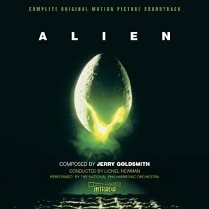
We also decided to look at another film, because we wanted to see if other films were varied with the amount of titles they have. So we looked at the film "Alien", which seems to be much older.
Colombia Pictures
A Film By...
Name...
THE GRUDGE.
Name...
Name...
Name...
Name...
Name...
Name + Name...
Name + Name...
With...
And...
Casting By...
Music By...
Editor...
Production Designer...
Director of Photography...
Co-Producers...
Executive Producers x 2...
Produced By...
Based On & Written and Directed By...
Screen play by...

We also decided to look at another film, because we wanted to see if other films were varied with the amount of titles they have. So we looked at the film "Alien", which seems to be much older.
Titles For "Alien"
A..Production...
A Film By...
Name...
Name...
Name...
Name...
Name...
Name...
And Name as...
Music By...
Executive Producer...
Screen Play And story By...
Produced By...
Directed By...
ALIEN.

Thursday, 29 January 2009
Editing the intro.
Both Poppy and I have started editing our footage.
We have been trying out using Adobe After Effects, it seems very complicated, but we are getting used to it. Poppy tried fiddling around with the contrast on her underwater shot to make it look more sea-like.
I thought that editing the intro would be an easyish task, but it is very time consuming and I want to perfect it all the time.
:)!
Friday, 23 January 2009
Second time filming!
On Monday, Poppy filmed Max jumping into the pool at our school to represent the body falling into the sea for shot 9, it went very well. It doesn't look to good just on it's own because you can see the ceiling which doesn't look realistic, so we will be using Adobe After Effects to create a realistic look.
On Tuesday, I did my shots two, four and five. I don't think that they went too well, because they are wobbly. I will edit them and see how well the look, if they are not very good I will do them again because I want it perfect.
On Wednesday, Poppy did the final bits of our filming, which was good. The problems we had was Vanessa hurting her feet again, because of the sharp texture of the floor, and Max hurt his face when he was getting rolled over, that was funny though!
Thursday, 15 January 2009
Second Filming.
Next week Poppy and I are going to do the final bits of our filming.
We hope to have it all filmed by the end of next week so that we will be able to have a fair bit of time to edit and get it correct.
We have had one problem that we are not allowed to take Vanessa out of school during the day, only in her lunch times and after school and on the weekends. By doing it after school it is difficult because of the amount of daylight left.
To complete everything I will have to film shots two, three, four and five.
Poppy has to do shots six and nine, shot nine is underwater and will be filmed at Langford Pool which is at school.
Subscribe to:
Posts (Atom)